This page only shows primary logo variants. For other related logos and images, see:
|
| 1988–1991 | 1991–1995 | 1995–2000 | 2000–2006 | 2006–2010 | 2010–2014 | 2014–present |
1988–1991
The initial YTV logo utilized three-dimensional CGI graphics to animate the logo in network IDs, which were usually set against different sky backgrounds that changed depending on the time of day (a night sky background for nighttime programs, a partly-cloudy blue sky for afternoon shows, etc.). Often in these network IDs, a script font would write various slogans ("The Spirit of Youth", "Young as You Are", "The Youth Channel", "Canada's Youth Channel") on the bottom right side of the logo. In 1990, the logo was altered slightly with the circle outline becoming consistent of three circles, and the "YTV" text becoming slightly larger.
1991–1995
The logo was revised in 1991, used the motif in which featured a large "Y" and the word "TV" in smaller type stacked vertically, that has been utilized in all of the network's logos since that time.
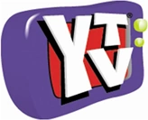
1995–2000
| SVG NEEDED |
The "YTV" text in this update to the previous logo was changed in 1994, arranged the same way as before, though with an altered design of the TV and logotype. In 1996, YTV started to use the slogan "You Rule" to go with the random objects and creatures that the YTV text is placed atop of.
2000–2006
In August 2000, the logo was changed again with the TV background dropped and the "YTV" text altered . In 2004, the YTV" text changed once more, but the monsters still aired.
2006–present
2006–2010
In 2006, this logo first appeared on YTV promos and on YTV's website. In 2007, YTV presentation was overhauled completely, though was still arranged similarly to the previous logos used since 1990, using a cyan circle with two spikes, similar to that of a hurricane symbol, with white rings inside and a revised "YTV" text overlayed atop it.
2010–present
2010–2014
In 2010. the logo was updated slightly with color gradients added to it.
2014–present
In 2014, YTV updated their logo, making some minor changes to it. On screen, they changed the direction of the logo making it face left instead of directly at the viewers (the print logo as seen above is not tilted). Along with light colour gradients being added to the logo, it debuted air on the website in 2014.