1969–1971
| SVG NEEDED |
The drawing in the logo is a stylized portrait of Melinda-Lou "Wendy" Thomas, R. David Thomas's daughter, after whom he named the restaurants. This is the first logo that was only used for the first restaurant.
1971–1975
| SVG NEEDED |
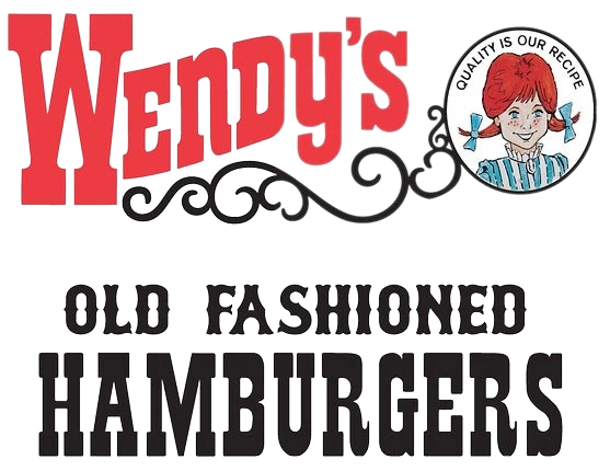
Second logo, similar to the first one, but added the slogan "Quality Is Our Recipe". Introduced after opening the second restaurant, which introduced the drive-thru pick-up window.
1975–1978

In 1975, Wendy was re-drawn for the first time with flat colors and the font for the tagline "Old Fashioned Hamburgers" was modified. The swirls became detached from the portrait of Wendy (but still remained attached for use on façades). However, signage still displayed the illustration from the first two logos.
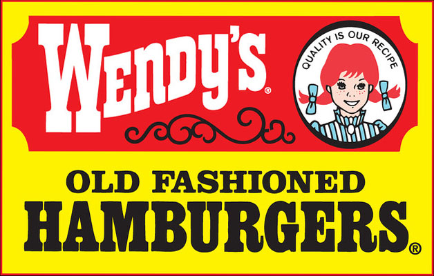
1978–1983
| SVG NEEDED |
In 1978, the logo was given a yellow background for the outside and a red beveled rectangle was given for the name Wendy's and the portrait of Wendy. The words "Old Fashioned" became re-aligned into the center. Again, signage still used the pre-1976 illustration. It references the facade of yellow rectangular panels with outlined red beveled rectangles. It is still used at a small number of locations, regardless of design updates.
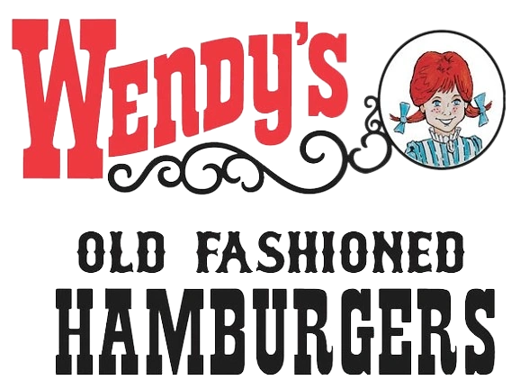
1983–2013
The fifth and longest-lived Wendy's logo debuted in late 1983 in the United States and expanded into Canada in 1984. In the Philippines (which entered sometime after the debut of this logo), it is known as "Wendy's Hamburgers". It had a jar-shaped frame with the mascot Wendy (with either white or flesh colored skin) centered at the top, and the frame referenced the chain's square hamburgers and architecture of the contoured mansard-style restaurants (introduced in 1983); the framed-corners buildings rolled out in 1992 while the overhanging façade with corners continued to be used for remodels of pre-1982 restaurants and for former commercial buildings. The name "Wendy's" and its tagline "Old Fashioned Hamburgers" traded places and swapped the colors. This logo was also the only logo to use the illustration of Wendy since the 1976 logo for signage. This logo was also used on packaging and opaque cups from 2012, but continued to be used on napkins, hot coffee cups, and cup lids for opaque cups from 2012. This logo and its variants still exist at more than 90% of the restaurants, and is still current in some countries, including New Zealand since its entry in 1986. The first advertising slogans for this logo were "You're Wendy's kind of people" (USA) and "That's fresh, that's class, that's Wendy's" (Canada), which were continued from the previous logo. Its only slogan in the Philippines since its entry is "It's the best time for Wendy's".
Variants
2007–2013
| SVG NEEDED |
The shorthand logo without the "Old Fashioned Hamburgers" tagline, used as the secondary logo. This version of the logo was primarily used during advertising and as Canada landmarking signs. It appeared on translucent plastic cups for Frosties and signature beverages from 2009, but appeared on Coca-Cola Freestyle labeled cups in 2012. In New Zealand, it is rarely known by this shorthand name, often to avoid confusion to the unrelated Australian chain Wendy's Supa Sundaes, also serving in that country.
2013–present

Wendy now has her head and braids peeking out of the circle with her shoulders no longer visible, the bangs have been restyled, the shading has been added to the hair and bows, and outlines around her eyes and lips are now thicker. The frame from the previous logo is removed, and is now simply as the mascot Wendy and the name Wendy's, though the positioning is similar. The font has changed from the classic "Western-like" font (similar to Egyptienne) to a handwritten script font (similar to Marker Felt), and only the "W" remains in uppercase, as well as the text became red and the background remained white. The previous logos had all letters uppercase, except for the "N" and the "Y". The "Old Fashioned Hamburgers" tagline and the black swirls have been removed, as well as doing away with the yellow that was one of their signature colors prior to this logo. The "Quality Is Our Recipe" slogan has been removed, although it is still their slogan. The tagline "Old Fashioned Hamburgers" only exists as their signature line of hamburgers. The mascot's face in this logo bears a heavier resemblance to Wendy Thomas's adulthood from reality and less cartoon-like. The color for the letters and background are sometimes swapped for signage, advertising, and certain packages. This logo has been introduced after the chain introduced four new restaurant designs in mid-2011, including "Ultra Modern" (with red blade), "Urban" (with red cylinder), "Contemporary" (with rectangular prism), and "Traditional" (with stone tower and silver waves). Earlier restaurants with the new designs used the previous logo. New and remodeled restaurants now carry this logo, are more eco-friendly and use approximately 70% less energy and water than their predecessors, and have Coca-Cola Freestyle fountains pre-installed. The only reference to the previous logo is for signage, but no longer has the jar neck surrounding Wendy. However, certain franchised restaurants may update to this logo without modernizing the layout of the buildings. This logo made its way to the American and Canadian chain websites on March 5, 2013. This logo currently carries the slogan "Now that's better" from the previous logo. The packaging as of February 25, 2013 uses the illustration of Wendy in monochromatic red as the primary logo while the complete logo itself is being used as the secondary logo in either its original colors or monochromatic red, depending on the packaging, and packages are now made from recycled fiber. The new cup lids only include the name, and no longer allows straws to penetrate through the logo.
")
Wordmarks
1969–2013
| SVG NEEDED |
The logo used separately by its name, as the tertiary logo. It appeared on the façade of the individual restaurants (with the mascot variant on the right side of it) and on service signs. The red lettering for façades was used since 1992 to replace the white. The white letters on a red background often appeared on billboards and service signs.
It also appeared on the translucent covers of plastic salad bowls and cream-colored plasticware. The full logo for plasticware was used before mid-2005, being replaced with only the lettering. From late 2011 until February 25th, 2013, it appeared as a secondary logo variant on packaging with the phrase "Quality (Real) Food Made Fresh Is Our Recipe". The Canadian chain uses the country's signature maple leaf in place of the apostrophe. This lettering continued to be used on the American and Canadian chain websites until March 5, 2013.
- Note that the word "Real" in parentheses indicates that it was used on translucent cups, while most opaque ones lacked the word "Real".
2013–present
| SVG NEEDED |
Faces
1969–1975
| SVG NEEDED |
The original illustration of Wendy. It was used on the primary logos and packaging and cups from 1969 until 1975, but continued to be used for signage until 1975. The signature slogan "Quality Is Our Recipe" was added in 1971.
1975–2013
| SVG NEEDED |
In 1975, the illustration of Wendy was re-drawn for the first time, and has been on primary logos, packaging and cups since then, but did not appear on restaurant signage until 1983. It appeared on the façade of the individual restaurants (with the name variant on the left side of it). An animated version of this illustration was seen on the commercials that aired between early 2008 and late 2009 with the slogan "It's waaaay better than fast food. It's Wendy's." From late 2011 until February 25, 2013, it appeared on packaging as the primary logo variant with variations of "Quality Is Our Recipe", depending upon the packaging and its sizes. This illustration also appeared on the corporate logo for The Wendy's Company from mid-2011 until February 25, 2013. It continued to be used as the chain's avatar for its YouTube channel and Facebook and Twitter pages until March 5, 2013.
2013–present
Gallery
")
External links
| T.J. Cinnamons | Wendy's | Wendy's Kids' Meal
International  |