This page only shows primary logo variants. For other related logos and images, see:
|
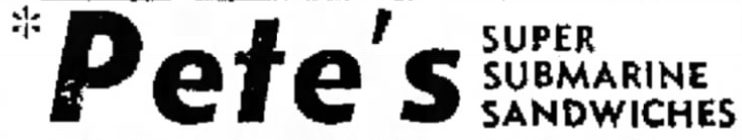
Pete's Super Submarines
1965–1967

|
SVG NEEDED
|
|
|
|
| Launched:
|
August 28, 1965
|
|
Subway was founded on August 28, 1965 under the name of Pete's Super Submarines. The first location was owned by the late Peter Buck and the late Fred DeLuca.
1967-1968
|
|
SVG NEEDED
|
Pete's Subs
1968–1970
Pete's Subway
1970–1972
|
|
| Typography:
|
Unknown ("*Pete's")
Custom ("SUBWAY")
|
|
|
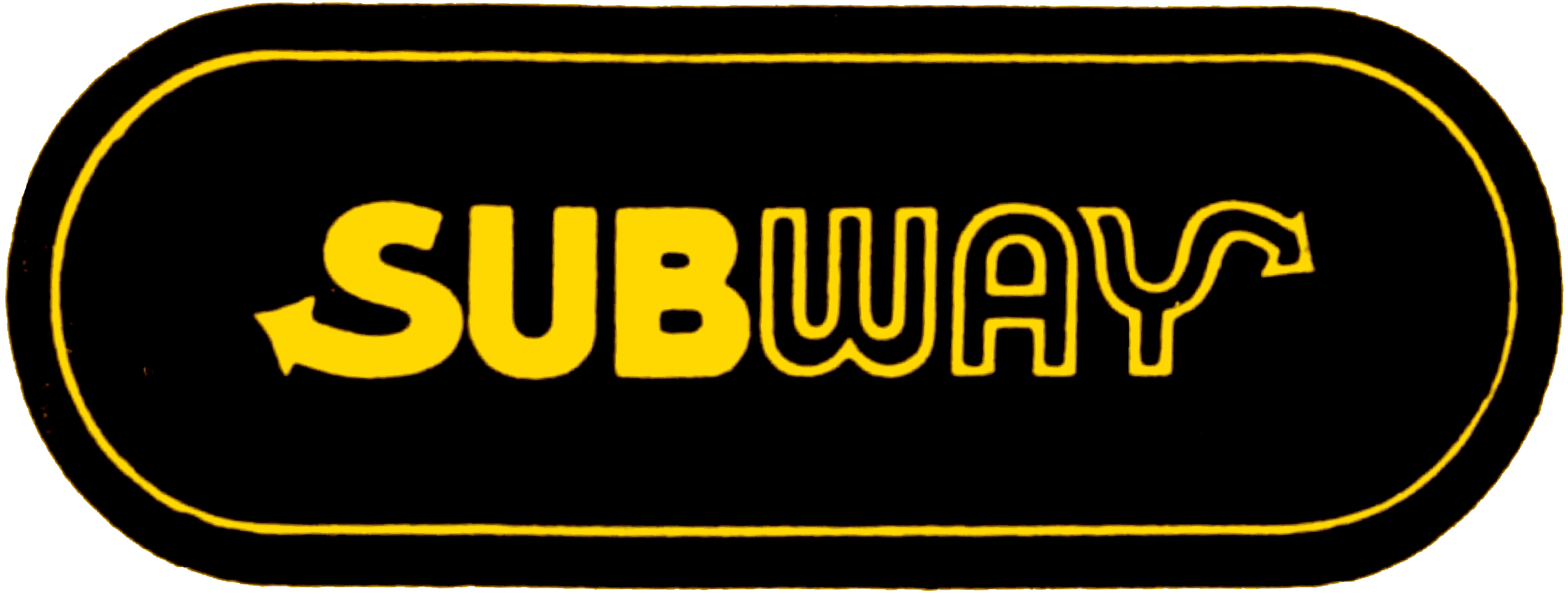
This marks the first use of the arrows in the S and Y of the logo, a motif that has been used by the company's logos since (this is done to promote "movement and motion", as it caters to a "very active, athletic" customer base, in addition to highlighting fast service).[1] This is also the first appearance of "Subway" in the name, in which it would be shortened to 2 years later.
Subway
1972–1973
As the chain continued its expansion across the U.S. in 1972, Pete's Subway was shortened to present-day Subway. The "Subway" here was borrowed from the previous logo. This logo was short-lived (most likely a placeholder), as it would quickly be replaced the following year.
1973-2002
1973-1976 (primary), 1976-1984 (secondary)
1976-1982
1981-1984
|
|
SVG NEEDED
|
1984-1988
1988-2002
In 1988, Subway introduced a modified version of the logo it had been using since 1976, introducing a bicolor scheme to the wordmark where the "SUB" was white and the "WAY" yellow (promoting "positivity and flavor").[1] Also, the oval was modified to take up less space.
After the next logo was introduced, most older locations kept using this logo until the late 2000s. However, some northern Canadian locations continue to use this logo. Additionally, it can also still be found on some Duke ovens at some locations, and on remaining interior decals at older locations.
2002–2016
|
|
| Typography:
|
Helvetica Neue Black Condensed Italic (modified)[2]
|
|
| Launched:
|
March 4, 2002[2]
|
|
On March 4, 2002,[2] Subway's logo got a "hip" makeover. During this time, the slogan "Eat Fresh." was used, which was introduced a year prior under the previous logo.
Here, the yellow color for the "WAY" was now a reference to the "freshness" of the food made there. An outline used with the previous wordmark in in-store branding since the late 1990s was incorporated here, with the green color that had been applied to the previous logo's oval in commercials during the same time, to refer to the "healthiness" of the chain's offerings.[2]
This logo is still used at most of its locations, but is gradually being phased out as they are being closed down or renovated, therefore having their signages updated to the current logo, which has been happening on a mass scale since 2021 (when Subway launched its current "Eat Fresh Refresh" campaign).
2015–2016
| Designer:
|
BBDO Worldwide[3] (based on the previous logo)
IB TYPE Inc.[4] (typefaces)
|
|
| Typography:
|
Helvetica Neue Black Condensed Italic (modified; logo)[2]
Six-inch
Footlong
(custom-designed)[4][5]
|
|
| Launched:
|
December 28, 2015
|
|
On December 28, 2015, Subway introduced a new, all-green version of its previous logo to go with its new slogan, "Founded on Fresh" (which would since quickly be changed to "Fresh Is What We Do"), referencing its origins and its place as a driving force in popularizing assembly line-style fast food, in addition to celebrating its 50th year and the life of DeLuca, who died earlier that year.[3]
This logo was short-lived (most likely a placeholder for the current one), lasting shy of only 8 months (which is why this was rarely, if any, used at any of its locations, since most have stuck with the previous one).
“ Panera and Chipotle talked about it and got all the credit. It annoyed us. We wanted to go back and stake the claim of freshness. That’s exactly what this ad is intended to do. It’s a departure from where the brand has been over the last few years, when our position was more of a value position. Long term, we came to the realization that was not sustainable. As we went through the brand revitalization process, we identified that our brand was based on fresh, but we lost that position. Our brand was fresh from the very beginning. We innovated all along.” |
— Chris Carroll, chief advertising officer of Subway from May 2015-October 2018 (2015)[3][6]
|
“This [ad] is about celebrating Fred DeLuca’s legacy, that Subway has been about ‘Fresh’ since it was founded in 1965”
|
— David Lubars, chief creative officer of BBDO Worldwide (2015)[3]
|
2016–present
|
|
| Typography:
|
ITC Bauhaus (modified, logo)
Six-inch
Footlong
(custom-designed)[4][5]
|
|
|
On August 5, 2016, Subway received its first dramatic overhaul in 14 years in an attempt to revitalize its brand image amidst falling sales.
The colors of the logo were swapped, while also having a striking resemblance to the 1988 logo, typeface-wise. Like the previous logos, this logo sometimes appears in yellow and white, but this time the logo's colors are reversed so that the "SUB" still appears in yellow and the "WAY" appears to be in white or green, instead of it being backwards. Additionally, a new "Choice Mark"[7] was created (see /Other), which consists of the two arrows making a big "S" with a smaller white "S" in the negative space. This identity would since then be rolled out to other countries starting in 2017.
“We see this as a way to refresh our look while remaining true to the brand’s roots by using the vibrant color palette of the mid ’60s when we were founded.”
|
— Subway spokeswoman (2016)[8]
|
“We’ve created a modern design that gives our guests choices – from how they order, to how they pick up their food, to how they enjoy their meal. The reactions from our guests, our franchisees and the Sandwich Artists has been incredibly positive.”
|
— Trevor Haynes, vice president of operations at Subway from October 2015-May 2018 (2017)[9][a]
|
On August 24, 2023, Subway announced that it would be acquired by Roark Capital Group for 9.5 billion US dollars, ending its family ownership after almost 60 years.[10]
References
- ↑ 1.0 1.1 Subway Logo and the History Behind the Business. LogoMyWay. Retrieved on July 10, 2022.
- ↑ 2.0 2.1 2.2 2.3 2.4 SUBWAY (RESTAURANT) 2002 LOGO VECTOR (AI EPS). HDicon (19 November 2010). Retrieved on July 10, 2022.
- ↑ 3.0 3.1 3.2 3.3 Maze, Jonathan (28 December 2015). New Subway ads invoke ‘fresh’ history. Nation's Restaurant News. Retrieved on July 10, 2022.
- ↑ 4.0 4.1 4.2 4.3 IB TYPE Inc. Font Foundry. MyFonts. Retrieved on July 10, 2022.
- ↑ 5.0 5.1 Andrew1988 (13 May 2016). Font used in recent Subway restaurant ads? (Not logo font). DaFont. Retrieved on July 10, 2022.
- ↑ Chris Carroll - Managing Director of Marketing, Sponsorships and Communications - Adirondack Sports Council. LinkedIn. Retrieved on July 10, 2022.
- ↑ 7.0 7.1 7.2 Huggins, Ashley (17 July 2017). Subway Brings ‘Fresh Forward’ With New Restaurant Design, Customer Experience. Subway. Retrieved on July 11, 2022.
- ↑ Whitten, Sarah (5 August 2016). After 15 years, Subway has a brand new logo. CNBC. Retrieved on July 10, 2022.
- ↑ Trevor Haynes - President North America - Subway. LinkedIn. Retrieved on July 11, 2022.
- ↑ Subway has been sold for billions in one of the biggest fast food acquisitions ever. USA Today (25 August 2023). Retrieved on August 28, 2023.
External links
Notes
a. Haynes currently serves as president of Subway as of November 2019.