1886-1923
Sears' first logo when it was simply a mail order catalog. This logo is still used today on promotional items.
1923–1958
Although this logo is officially retired, one store that opened in Duluth, Minnesota in 2007 still using this logo.
See it here: http://www.labelscar.com/retail-news/sears-duluth-concept
1958–1963

The "ears" portion of the logo became uppercase, and the font became Goudy Old Style. This logo can still be seen at some malls. This logo was still used at some locations after its retirement.
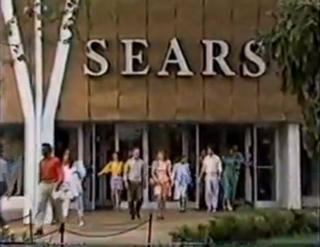
Screenshot of a commercial from 1989 of the Oak Brook, IL location with the 1950's logo.
1963–1984
1984–1994
.png)
In 1984, the logo was updated to the Helvetica typeface with white lines inside the letters.
1994-2004
This is a modified version of the 1984 logo. This logo is still in use in Mexico, and is still widely seen in the United States despite being succeeded by two other logos. This logo is still in use at several stores in the United States and at the store inside the Arden Fair Mall in West Sacramento. This logo is like the Sega logo.
2004–2010
In November 2004, following the merger with Kmart and the creation of the Sears Holdings Corporation, the "ears" part was changed to lowercase. This logo is still used for several of Sears' subsidiaries, and also in Canada.
2010–present
In late 2010, the entire font on the wordmark was changed and made lowercase.