| 1874–1910 | 1910–1925 | 1925–1974 | 1974–1985 | 1985–2006 | 2006–present |
1874–1910[]
| NO KNOWN LOGO |
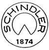
1910–1925[]

The logo how it looks like when the elevator company was founded. The logo symbolized perfection, the compass at the bottom, precision and the art of engineering. Inside the compass is the year the company was founded.
1925–1974[]
| SVG NEEDED |
In 1925, the logo was simplified and officially registered. The original compass image was made more abstract and reduced to two lines.
1974–1985[]

| SVG NEEDED |
The Schindler logo was changed in 1974 to be darker and easier to read and recognize.
1985–2006[]

The Schindler logo was radically redesigned and modernized in 1985 with red stripes as the dominant motif.
2006–present[]

The traditional Schindler logo shape returned in 2006 with the company name in the same red as the “stripe logo” in 1985.