| 1984–1985 | 1985–1986 | 1986–2001 | 2001–2004 | 2004–2008 |
| 2011–2016 | ||||
| 2008–2009 | 2009–2011 | 2011–2016 | 2016–present | |
PKS
1984–1985
In 1984, Sat.1 was first called PKS (Programmgesellschaft für Kabel- und Satellitenrundfunk (Program Society for Cable and Satellite Broadcasting)).
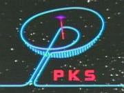
Sat 1
1985–1986
In 1985, PKS was renamed Sat 1, and its first logo consists of a color wheel with 16 stripes.
Sat.1
1986–1996
At this point, the logo has been totally changed. The wheel is now a ball and the name of the channel was introduced onto the logo. The 16 stripes were reduced to 12.
1996–2001

In 1996, an alternative logo was introduced, which uses the SAT.1 wordmark inside a black oval.
2001–2004
Having used the same logo for almost all of its existence, Sat.1 adopted an altered logo along with a new on-air design on September 1, 2001. The ball did however remain, and is at the center of the graphics, created by Velvet mediendesign. The number of coloured stripes on the ball was reduced from twelve to nine, and the font of the text changed. The redesign came with a new slogan, "Powered by emotion".
")
")
")
")
")
- Velvet mediendesign
- Powered by emotion: SAT.1 ab Samstag mit neuem Look und neuem Logo
- Netzeitung.de - SAT.1 "Powered by emotion"
2004–2008
Another redesign was launched on September 3, 2004, this time with graphics by Bruce Dunlop & Associates in Munich. The new slogan became "Sat.1 zeigt's allen" ("Sat.1 shows it all"). Also, the ball simply became red.
2008–2009

In 2008, the ball becomes the main logo and is separated from the text. The number of stripes on the ball is reduced from nine to eight.
- Sat.1 mit neuem Markenauftritt ab 17. März 2008 Der Ball wird zum Logo
- http://www.sat1.de/neuermarkenauftritt/
- EEFOE - Sat.1's new look in 2008
2009-2011
The ball received a makeover on September 16, 2009. The ball is now given a silver 3D look. Along with the new logo, the station received new graphics and a new tagline: "Colour Your Life".
")
2011–2016
On August 16, 2011, Sat.1 unveiled a refreshed logo (which returned the old rainbow colors of the ball, but still keeping the previous 3D look) developed by Creative Solutions, the in-house agency of Sat.1's owner, ProSiebenSat.1 Media. With this logo, the channel states to emphasize its slogan, "Colour your life!" and the versatility, diversity and modernity of its programming. The logo also represents the message that Sat.1 is the channel for the whole family and for the emotions.
- Das neue SAT.1: der Ball wird wieder bunt, SAT.1-Stars als Marken-Botschafter
- Presseportal.de - Das neue SAT.1: der Ball wird wieder bunt, SAT.1-Stars als Marken-Botschafter (mit Bild)
- SAT1-Ball wieder bunt
- Bunter Ball, mehr Struktur: Sat.1 frischt Design auf
- The Branding Source - SAT.1 reveals new logo
")
2016–present
On October 12, 2016, Sat.1 refreshed their iconic logo once again (designed in-house by Creative Solutions), this time with the ball's segments reduced from eight to seven, along with the color ribbons drawn thicker and given more prominence and the ball itself rendered more glossy and vivid. The new design is reminiscent of the 2001 logo.
- Art of Channel Branding
- PromaxBDA
- Creative Solutions
- Satte Farben: SAT.1 ändert Senderlogo
- Griff zum Farbtopf: Sat.1 überarbeitet sein Logo
| Seven.One Entertainment Group Free-to-air channels: Austria: Puls 4 | Puls 24 | ATV1 (II1) | ProSieben Austria | Sat.1 Österreich | kabel eins Austria | sixx Austria | ProSieben Maxx Austria | Sat.1 Gold Österreich | kabel eins Doku Austria Switzerland: Puls Acht | ProSieben Schweiz | Sat.1 Schweiz | kabel eins Schweiz | sixx Schweiz | Sat.1 Gold Schweiz | ProSieben Maxx Schweiz Pay television channels: Newscasts: Direct-to-consumer and digital services: Production companies: Other assets: Red Arrow Studios Europe: July August Productions (Israel) | NERD (United Kingdom) | CPL Productions (United Kingdom) | Cove Pictures (United Kingdom) | Snowman Productions (Denmark) | Endor Productions (United Kingdom) | Redseven Entertainment (Germany) | Nit Television (United Kingdom) Digital and distribution: Digital ventures: ParshipMeet Group: Eharmony | ElitePartner | Meetme | Skout | Tagged | GROWLr | Lovoo | Parship Former assets: Divested:
Notes  |