This page only shows primary logo variants. For other related logos and images, see:
|
SBT was formed in 1981 with three former-Rede Tupi stations (Channel 4 from São Paulo and Channel 5 from Porto Alegre and from Belém), TVS Channel 11 and TV Continental Channel 9 from Rio de Janeiro, TV Alterosa from Minas Gerais, and other 8 affiliated stations.
| 1981–1985 | 1985–1988 | 1988–1995 | 1995–1996 |
| 2002–2012 | |||
| 1996–2002 | 2002–2012 | 2012–2014 | 2014–present |
1981–1985

This logo was used on early SBT idents from 1981 to 1985. The text reads Sbt back then.
1985–1988
Starting in 1985, a new logo debuted. It was now a gold/tinted sliver ring with the "sbt" text in gold/tinted sliver and in the center.
1988–present

1988–1995
In 1988, SBT, alongside TVS, changed its logo design to one of its most famous in its history, which contains mult-colored stripes forming a circle where the text "sbt" sits on.
1995–1996
| SVG NEEDED |
In 1995, SBT removed the colors for a black logo with white gradients.
1996–2002
| SVG NEEDED |
In 1996, SBT, in celebration of its 15th year, reinstated the colors, but this time, in the form of solid gradient colors. The main logo consisted of only red, green, and blue as its colors, but on station idents, the amount of colors are increased from three to six with the addition of three more colors, orange, yellow, and purple. It was also launched alongside a special animation in which the colors were rotating clockwise or counterclockwise, which lasted until 2004. One of the variations of this logo contained dots generated by light, resembling a disco ball. In 2004, it became the main logo and the 1996 logo was retired.
")
")
2002–2012
As mentioned above, this is the former variant of the 1996 logo. It shares the same traits as the previous logo but lacks the distinct animation the previous logo was known for.
2012–2014
In 2012, the logo gains small but noticiable effects, such as the text begin clearer and the circle now more spheric.
2014–present

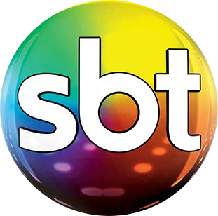
This logo marks one of the biggest revamps on SBT's logo in its history, dropping all 3D effects in favor of a minimalist, 2D, and flat logo, but keeping the colors of the previous logo. (Four months ago, its rival Rede Globo also launched a new logo, in an effort to release a streamlined look that approaches minimalist 2D design). In an awkward fashion, the logo resembles or is inspired by the icon of the Photos app of iOS from iOS 7 onwards.
The new version of the SBT logo became effective on August 17th, 2014, at 11:30am BRT.
Sistema Brasileiro de Televisão
|
|---|
| Current programming Varieties: Chega Mais | Fofocalizando | Programa do Ratinho | É Tudo Nosso! | Programa Raul Gil | Operação Mesquita | SBT PodNight | Notícias Impressionantes | Circo do Tiru | Sabadou com Virgínia | Domingo Legal | Eliana | Programa Silvio Santos Upcoming programming
Defunct programming 1Co-produced with Buena Vista International Television  |
| Sistema Brasileiro de Televisão Owned-and-operated stations: São Paulo (Ribeirão Preto | Jaú) | Rio de Janeiro (Interior) | Brasília | Porto Alegre | Belém Media Capitalization and Lottery Other
1The remaining assets are owned by Grupo Massa. |
| Institutional Members ATA | ARPA | ABERT | ANATEL (Chile) | ARCHI | ASOMEDIOS | CANARA (Costa Rica) | ACTVE | AER | ASDER | NAB | Cámara de Radiodifusión de Guatemala | Cámara de la Industria de la Radio y Televisión | Unión Nicaragüense de Radiodifusores | Asociación Panameña de Radiodifusión | Asociación Paraguaya de Radiodifusión Privada | Cámara Paraguaya de Estaciones de Radio y Televisión | Sociedad Nacional de Radio y Televisión (Perú) | Asociación Nacional de Broadcasters Uruguayos | Cámara Venezolana de Televisión | Cámara Venezolana de la Industria de la Radiodifusión | Unión de Asociaciones de Radiodifusión de Centro América Television  |