- For the discussion forum by Microsoft, see Channel 9 (website).
This page only shows primary logo variants. For other related logos and images, see:
|
The Nine Network is a television network in Australia. The Nine Network logo, which consists of a numeral 9 beside nine dots arranged in a 3x3 grid, is one of the most iconic logos in Australia.
| 1970–1977 | 1977–1988 | 1988–2006 | ||
| 1959–1963 | 1963–1970 | 1970–1977 | 1977–1988 | 1988–2006 |
| 2006–2008 | 2008–2009 | 2009–2012 | ||
| 2006–2008 | 2008–2009 | 2009–2012 | 2012–present | |
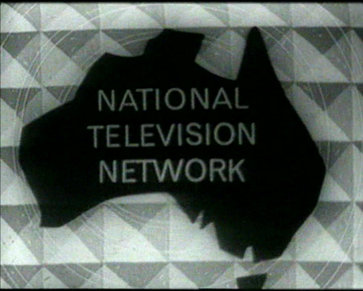
National Television Network
1959–1963
National Nine Network
1963–1970

1970–1977
In 1970, Nine Network adopted this classic logo. The logo is a modern "9", with nine dots to the left of it. For broadcasts in Black & White, the entire logo is in white.
Starting in 1975, when the network began broadcasting in colour, the logo colouring was changed to yellow, the background is blue, and "LIVING COLOUR" was added below the logo.
1977–1988
.svg "Nine1977 (Print).svg (3 KB)")
In 1977, the dots were taken off the logo, but only for on-air station idents.
Nine Network
1988–2006
In 1988, The company dropped "National", and was renamed to the "Nine Network", and the dots were added back in the logo.
In 1997, the dots were changed to spheres, but these spheres returned to dots as a new on-air ident package was created by Velvet Mediendesign in 2001.
In September 2002, the dots were changed back to spheres as well as the 9 becoming 3D for their '7 colours for a 7 days' presentation package.
2006–2008
In January 30, 2006, the network and its affiliates relaunched their logos to coincide with Nine's 50th anniversary. The iconic '9' numeral was reworked with a few rounded corners eliminated in the process. The logo uses a 2D blue cube with the new '9' inside it, which saw the removal of the nine dots again. The graphics package used during that time was designed by Bruce Dunlop Associates.
In May 2007, Nine partially relaunched the nine dots, which is visible in every second surface of the box.
")
")
2008–2009
As a part of a major relaunch, Nine Network completely reinstated the nine-dots logo on January 14, 2008. The dots are represented by translucent 3D discs during that year. The music used throughout the network's idents and promotions was "Smile"' by The Supernaturals.
This time, these dots are now a bit bigger and the "9" of the previous logo continues. It was only used in Sydney, Melbourne, Brisbane and Darwin markets.
However, it was not revived on the Perth and Adelaide stations because they were both owned by WIN Corporation at that time and WIN Television, a Nine affiliate, decided not to revive the dots due to affiliation disagreements.
In January 2009, the dots are once again 2D as part of a brand refresh and short-lived presentation which lasted until September 2009.
2009–2012
Later on September 2009, the dots are changed to spheres yet again when the network's current slogan Welcome Home was launched. The dots were made smaller, like the old logo.
In March 2010, the dots were reinstated in both Perth and Adelaide.
2012–present
In April 2012, Nine Network's identity changed, applying the logo in different colours such as red, green, purple and more. It is also reminiscent of the 2002 ident package.
Coincidentally, the identity was launched a decade after the launch of the aforementioned ident package.
.svg "Nine 2012 (Print).svg (6 KB)")
")
Template:FreeTV Australia

