On April 13th, 2003, the local mobile telecommunications companies owned by Telefónica and Portugal Telecom in Brazil merged, under the Vivo ("alive", in Portuguese) brand (In 2010, PT sold its stake in Vivo to Telefónica). Originally, the logo, designed by Wolff Olins, could be blue, red, green or yellow. Yellow was later replaced with orange, and purple was added later.
Logo under a 90° angle, in orange
The Vivo mascot, in yellow (color no longer in use)
The Vivo mascot, in blue.
The Vivo mascot, in some of the poses and colors it's used.
BETTER LOGO NEEDED
The Vivo mascot, in purple.
The Vivo mascot, in orange.
2012–2016[]
Designer:
Asia Branding
Typography:
Custom-designed (logo) Vivo Regular (custom-designed) Officina Serif
Launched:
Unknown
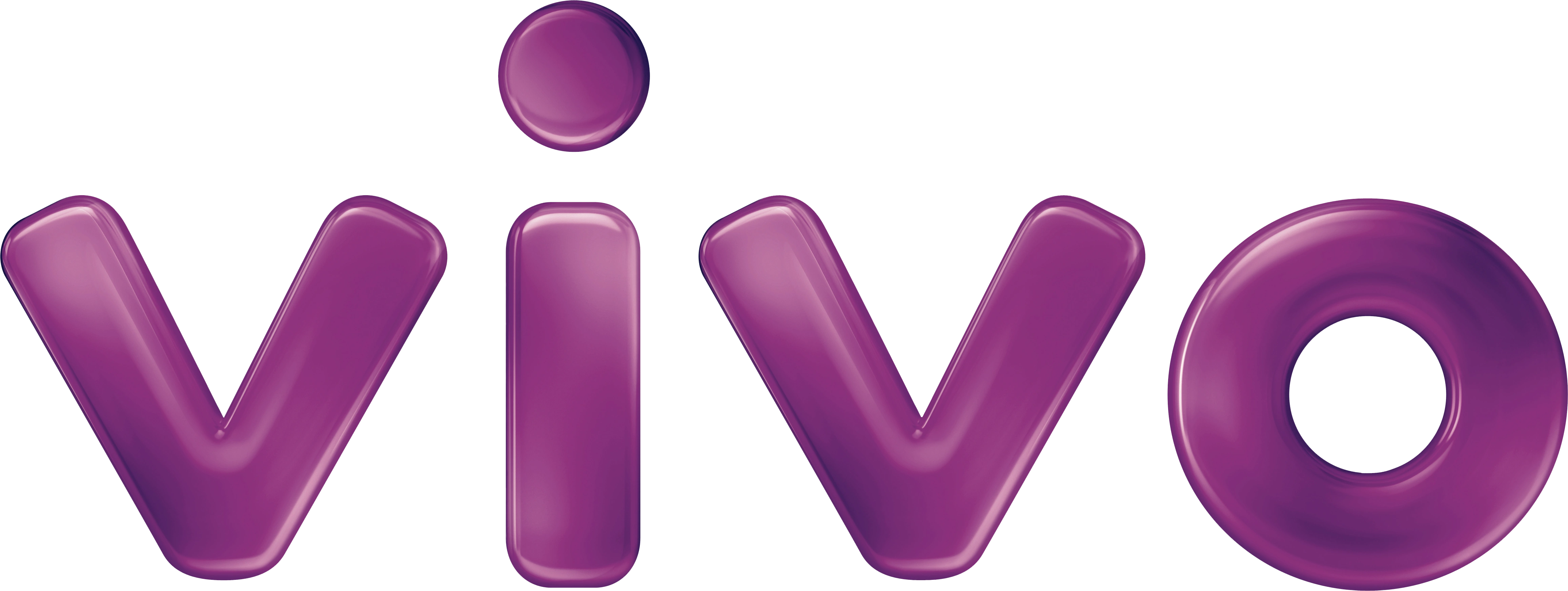
On April 15th, 2012, a 3D version of the wordmark, designed by Asia Branding (spun off from, then re-merged into advertising agency Africa Creative - part of Omnicom's DDB network - Vivo's agency of record since the launch of the brand), used in purple, blue, green or orange (red had limited use, such as a co-branded credit card with Santander). The mascot remains in use, currently also used as a 2D design element, as well as its usual 3D versions.
This logo was used to represent the Telefónica activities in Brazil at the corporate level since the Vivo brand is used for Telefónica's services in that country.
Alternate flat version of the Vivo mascot
Illustration showing all Vivo areas (fixed telephony, mobile phone, pay-TV and Internet)
Custom-designed (logo) Vivo Regular (custom-designed) Officina Serif (2016-2022) Vivo Type (custom-designed, 2023-present)
Launched:
Unknown
On April 13th, 2016, the Vivo brand identity was refreshed (by Lambie-Nairn, later merged into Superunion, further absorbed by Design Bridge and Partners), the 3D wordmark was retired and purple was consolidated as the main color for the Vivo branding, with lilac, pink, orange, green and blue as secondary colors.

")
")
")
")
")
")
")
")
")
")
")