| 1951–1975 | 1975–2002 | 2002–present |
1951–1975[]
Originally, the center of the logo depicted a silhouette of a woman with a full shopping cart. When the next logo was introduced in 1975, all locations quickly replaced this logo with the next...
1975–2002[]
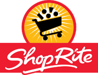
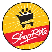
In 1975, ShopRite's logo changed, although retaining the same shape and colors on the previous logo, many adjustments were made. The most prominent change being the switch of the image in the center. It was now changed into a simplified shopping cart with stacked circles representing goods above it. As well as that modification, the typeface was updated and more uniform instead of being pinched towards the center, the hyphen was omitted, the "SUPER MARKETS" text was dropped, and the logo became tilted to the right a little. This logo is still on some locations, as well as some delivery trucks and their sandwich cookies.
2002–present[]
In 2002, the circle's color changed from yellow to gold. One of the circles is replaced with a trapezoid, with another of the circles being replaced with a rectangle. The ShopRite wordmark becomes cursive, and is repositioned underneath the cart.
External links[]
KB Toys Company
|
|---|
| KB Toys | Rag Shop | ShopRite | Mandee | The Party Outlet | Carter's |


