| 1970–1987 | 1987–1992 | 1992–2001 | 2001–2011 |
| 2011–2012 | 2012–2016 | 2016–2023 | 2023–present |
Nationwide (first era)[]
1970–1987[]
Nationwide was originally founded in 1884 as the Co-operative Permanent Building Society and adopted its current name in 1970.
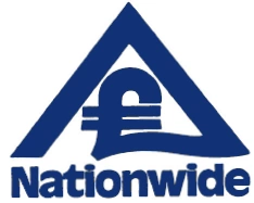
Nationwide Anglia[]
1987–1992[]

In 1987, Nationwide merged with Anglia Building Society.
Nationwide (second era)[]
1992–2001[]
In 1992, Nationwide reverted back to its old name.
2001–2011[]

In 2001, the Nationwide font was changed, the green removed from the tree and everything placed into a new box, complete with a red bottom.
2011–2012[]

A 3D version of the 2001 logo had been in use between 2011 & 2012. At the same time, a new strapline was introduced: 'On your side'.
2012–2016[]
In 2012, the logo was changed adding gradients and silver outline. Nationwide took over the Cheshire Building Society fascia in October 2014, causing all 32 Cheshire Building Society branches to close down.
2016–2023[]

A flat logo began to be rolled out in June 2016, looking very similar to the 2001 variant.
")
2023–present[]
|
|
|
References[]
- ↑ Fulleylove, Rebecca (10 October 2023). Nationwide releases biggest rebrand in over 30 years. Creative Review. Retrieved on October 10, 2023.