| ????–1961 | 1961–1979 | 1979–1985 | 1985–2007 | 2007–2016 | 2015–2021, 2021–present (secondary) | 2021–present |
Morrisons Supermarkets[]
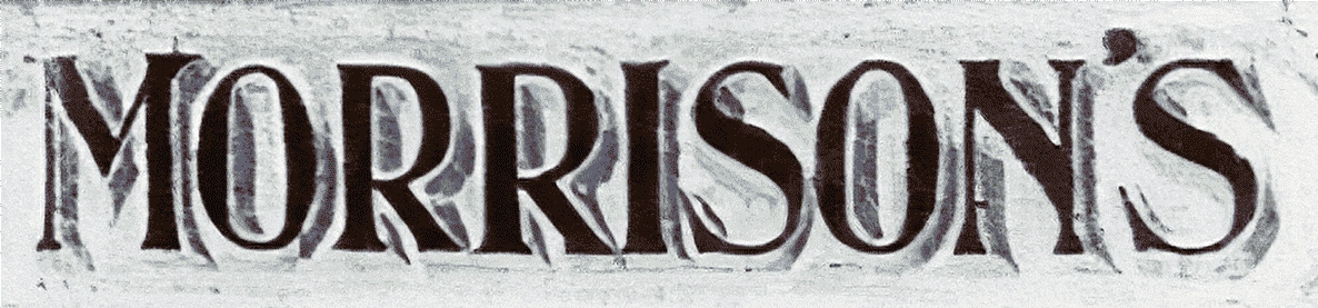
1899–1961[]
1961–1979[]
| SVG NEEDED |
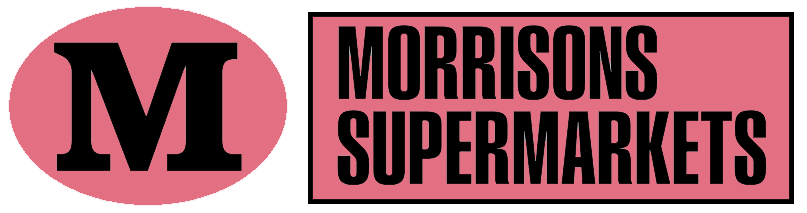
Morrisons[]
1979–1985[]
| SVG NEEDED |
1985–2007[]
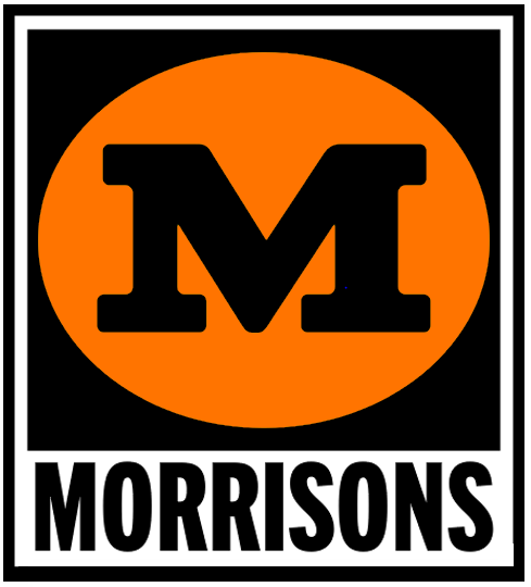
2007–2016[]
|
|
|
On 15 March 2007, Morrisons announced that it would ditch its existing branding and strapline, in favour of a more modern brand image.
The change saw the replacement of the old yellow and black logo, along with the "More reasons to shop at Morrisons" strapline, replaced with "fresh for you every day" or "fresh choice for you". It also involved the replacement of external signage, with the previous Morrisons signs being retained alongside the new logo, as well as changes to product packaging, point of sale, advertising, staff uniforms (replacing the old blue ties and bows with green ones) and distribution vehicles. The rationale behind the decision was the need for Morrisons to attract a wider national customer base, capitalising on its expanded geographical spread following the acquisition of Safeway.
")
2015–2021, 2021–present (secondary)[]

This logo was tested in 2015 at selected Morrisons stores, like the Merrion Centre in Leeds and the company's new convenience store brand Morrisons Daily before being fully launched in 2016.
2021–present[]

A brighter colour palette was introduced in 2021, and the "Since 1899" strapline subsequently dropped.
Morrisons
|
|---|
| Stores: Morrisons | Morrisons Daily | McColl's (Martin's) Own Brands: Discontinued: Clubs & Services: Discontinued:  |