Atlantic Southeast Airlines[]
198?–199?[]
199?-2010[]
2010-December 31st, 2011[]
SureJet[]
Proposed[]
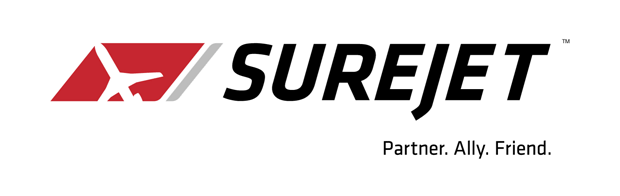
On November 12, 2010, Atlantic Southeast Airlines bought ExpressJet Airlines. In return, a new logo was unveiled on July 13, 2011. The logo, according to ASA, featured its airplane icon used by the airline itself, and a font which looks different but similar to ExpressJet's font. However, after 2 days of backlash and negativity among employees of both airlines, the rebrand was put on hold on July 15, 2011. ASA cited that it had "missed their [our] mark" when it rebranded the airline once it completed its merger with ExpressJet.
- "On July 13, we announced that SureJet would be the new name of our combined airline, once our merger is complete later this year. Since the announcement, we have heard significant concerns from team members about the name SureJet, and it appears we’ve missed our mark. The No. 1 goal with our new name was to create an identity that represented our people, and that our people would be proud of. Since we value the feedback we’ve received to date, we have put a 'ground stop' on the SureJet name so we can solicit further input from our people, and get this important merger milestone right."
The new, merged company would use the ExpressJet name on December 31st, 2011, after almost 3 months looking over the company's suggestions through its combined workforce.
- Atlantic Southeast, ExpressJet put “ground stop” on “SureJet” - Atlantic Southeast Airlines PR
- The Branding Source - SureJet (Includes July 13 press release regarding proposed rebrand)
- Atlanta regional airline backtracks on new name - ajc.com
ExpressJet Airlines[]
- See also: ExpressJet Airlines
It was announced by Atlantic Southeast Airlines on October 14th, 2011 that ASA would change its name to ExpressJet Airlines on December 31st. The logo would combine elements from Atlantic Southeast Airlines' (forward box) and ExpressJet's (wordmark) logos, The thin, gray parallelogram was given a slight refinement, having its top left and bottom right corners being rounded, like the proposed logo for SureJet.