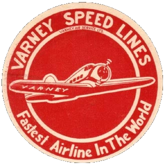
Varney Speed Lines
1934–1937
Continental Airlines
1960–1967

1967–1991

In 1967, Continental introduced a classic logo created by Saul Bass.
")
1991–2011

On February 12, 1991, Continental unveiled a completely new logo and livery. The logo shows a part of a globe with highlighted longitudes and latitudes. Most of the livery would be white, with the exception of the tail which would be blue with the company logo on it. The new look was the result of 14 months of research and design by Lippincott & Marguiles in New York.
- "We want to send a strong signal to the world that wa are new and improved, that we are strong and that we are putting the negative events of the past behind us" - Continental chairman Hollis Harris in an article.
The logo shown above is one of several versions of the Continental logos. In the logos used on Continental's tailfin, the longitudes are in gold. There are also several versions where the word "Airlines" is omitted. There is also two different versions of the globe. The regular version (6 pica) is used when the box around the globe exceeds 0.5 inches. When the box is smaller than 5 inches, a simplified version (3 pica) is used. This version has thicker lines and less detail, which makes it render better online or in small print.[1]
")
In April 2010, it was revealed that Continental was merging with United Airlines. The new company took the United name, but used Continental's visual identity. The merger occured on November 30, 2011.