| 1997–present | ||||
| 1958–1963 | 1963–1971 | 1971–1991 | 1988–1997 | 1997–present |
| 1927–1988 | 1988–present |
The British Broadcasting Corporation (BBC), founded in London on 28 October 1922 as the British Broadcasting Company Ltd, is one of the world's largest broadcasters.
BBC blocks
1958–1963

The first version of the BBC blocks was introduced circa 1957, consisting of square blocks containing italic BBC letters. The font is thought to be a variation of Univers.
1963–1971
In 1963, the blocks became slanted to match the angle of the letters.
1971–1991

Then, in 1971, the corners of the blocks became round. These first three versions of the blocks were used mainly for the television services (with, where necessary, the addition of a fourth block containing "tv", "1" or "2"), and on associated merchandise. The Corporation's national and local radio stations, for the most part, retained their own identities.
1988–1997

In August 1988, the BBC decided to introduce a more cohesive identity across all of its output, and so commissioned Michael Peters to design a new version of the blocks.
They thus regained square corners and were slanted to an angle of 17 degrees, while the font for the letters was changed to Helvetica. More importantly, three coloured lines were added underneath - blue, red and green being the phosphors of a colour television picture, as well as representing the three national BBC regions (Scotland, Wales and Northern Ireland).
Although the logo was intended to herald a more cohesive identity, its adoption proved slow: copyright notices at the end of TV programmes and video releases did not start using it until 1990, as did the radio stations, while corresponding new identities for both BBC1 and BBC2 did not appear until February 1991.
The logo also proved problematic in several ways: its slanted nature meant that it did not work very well on screen or at a small size, while it did not look comfortable when used alongside upright fonts. In addition, printing costs were high due to the coloured lines. However this logo was officially dropped on 4th October 1997 but BBC Radio Clwyd continued using this logo until the station closure in 1998.
1997–present
On 18 April 1997, with the Internet growing in popularity and digital television on the horizon, the BBC commissioned Lambie-Nairn to design a modernised logo, which includes a new, simpler and cleaner version of the blocks.
This version abolished the slants and the coloured lines in favour of simple square blocks containing upright letters, in Gill Sans font.
According to Lambie-Nairn, this choice of font was particularly appropriate for the BBC: "The sculptured panels and Prospero and Ariel statue which adorn Broadcasting House were created by Eric Gill in the 1930s. And by choosing a typeface that has stand the test of time, we avoid the trap of going down a modish route that might look outdated in several years time."
After 9 years, the logo was introduced across all of BBC's television and radio services on 4 October 1997. At first, the services all followed a consistent scheme, whereby the name of each would appear to the right of the logo in the same font. By the end of 2002, most services were using a different design with the logo and name on top of each other in a box.
BBC Coat of Arms
1927–1988
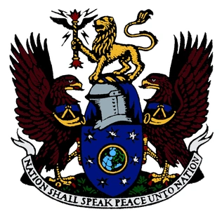
Shortly after receiving its first Royal Charter in 1927, the BBC was granted its own armorials by the College of Arms.
The British lion forms the 'crest' of the arms, and the thunderbolt it holds is a heraldic way of representing broadcasting. The eagles form the 'supporters', and represent speed, while the bugles they wear round their necks symbolise public proclamation.
On the shield is the globe surrounded by seven stars, which represent the other seven planets in the Solar System and hence reflect the scope and breadth of the Corporation. Finally, the motto, "Nation shall speak peace unto nation", is based on verses from the Old Testament (Micah 4:3 and Isaiah 2:4).
1988–present
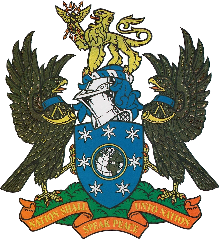
An updated Coat of Arms was introduced with the underlined BBC logo (see above) in 1988, retaining all the properties of the original arms but making them appear more defined.
Other
Template:Other
External links

| Eurovision/Euroradio ARD |
ARMR |
ARMTV |
BBC |
BHRT |
BNR |
BNT |
ČRo |
ČT |
CyBC / RIK |
DR |
ENRS |
EPTV |
ERR (ETV) |
ERSL |
ERT (ERA) |
ERTU |
GPB |
FMM (F24 | MCD | RFI) |
France.tv |
HRT (HR) |
İCTI (İR | İTV) |
JRTV |
Kan (IPBC) |
LNC |
LRT |
LSM (LR | LTV) |
MMD |
MRT |
MTVA (Duna) |
NPO |
NRK |
NSTU |
ORF |
PBS Ltd. |
PR |
RAI |
Radio France |
ROR |
RT |
RTBF |
RTCG |
RTÉ |
RTL |
RTP |
RTS |
RTSH |
RTVA |
RTVE (RNE | TVE) |
RTVS |
RTVSLO |
RÚV |
SMRTV |
SNRT |
SRG SSR |
SRT (SR | SVT | UR) |
TDA |
TG4 |
TL |
TRM |
TRT |
TT |
TV 2 (Denmark) |
TV 2 (Norway) |
TVP |
TVR |
UKIB (ITV | S4C | STV) |
VR |
VRT |
Yle |
ZDF Associated members Approved members Competitions Awards ceremonies Defunct competitions |